
 Home
Home Health
 Diet & Nutrition
 Living Well
 More
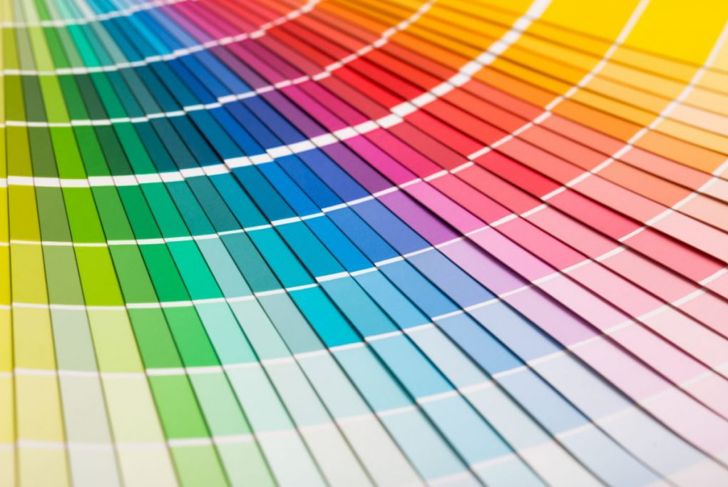
MoreThere are several definitions for complementary colors, depending on the color model. By most definitions, complementary colors are those that cancel each other when they combine or mix together. When the colors are next to each other, they provide the greatest possible contrast. This contrast has led to many people referring to complementary colors as “opposite colors.” There are many possible complementary color pairings, though each color model has its own main complementary color pairs.
Traditional Color Model
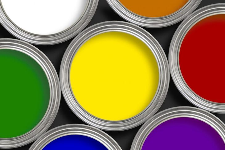
In the 18th century, the traditional color wheel came into existence, and it is still in use today. This color wheel features red, yellow, and blue as the primary colors. Its complementary pairs are red-green, yellow-purple, and blue-orange. Mixing any two primary colors will create the complementary color of the remaining primary color. As an example, mixing red and blue would create purple to compliment yellow. Additionally, because the model is prevalent in painting, it uses subtractive coloring. This refers to the fact that paint absorbs light, meaning that mixing all three primary colors together will result in black or gray color. In recent years, more accurate coloring guides name magenta, cyan, and yellow as the primary colors.
The RGB Model
Around the mid-1800s, photographers began to experiment with different color filters for colored photographs. In the 20th century, the model was complete, and the RGB color model became commonplace. Its name comes from its three primary colors: red, green, and blue. The RGB model uses different combinations of these three primary colors to create various other colors. Under the RGB model, the light of two complementary colors at full intensity will create white light. The complementary color pairs for this model are green-magenta, red-cyan, and blue-yellow.
Color Printing
Like painting and the traditional color model, color printing relies on subtractive colors to create its various hues. However, its complementary colors are different than those of the traditional color wheel. Color printing uses the modern CMYK color model, making its primary colors cyan, magenta, and yellow. It also uses black to increase the range of tones it can create. In color printing, the most common complementary pairings are magenta-green, yellow-blue, and cyan-red. This model provides similar results as the RGB color model, and adding black allows the model to darken colors.

Science of Complementary
Many people may wonder why complementary colors are pleasing to the eye. Scientifically, it all comes down to the eye. The human eyes have several types of photoreceptor cells that help with seeing color. Different types of cells can perceive different types of light from the color spectrum. As a test, stare at a red piece of paper for several minutes. Once you’re done, look at a white wall or a white piece of paper. You’ll likely see a faint cyan image. The eyes are perceiving the white spectrum of light but with a little less red, resulting in the complementary cyan. This occurs because the photoreceptors responsible for seeing red become fatigued and lose some of their ability to send that information to the brain.

Warm and Cool
An important thing to note is that every main pairing of complementary colors consists of warm colors and cool color. Warm and cool are terms that describe the vividness or boldness of color. Warm colors such as red and yellow are dynamic and bold, but cool colors like cyan and purple are soft and gentle. Because they are dramatically different, warm colors and a cool colors will always have contrast.
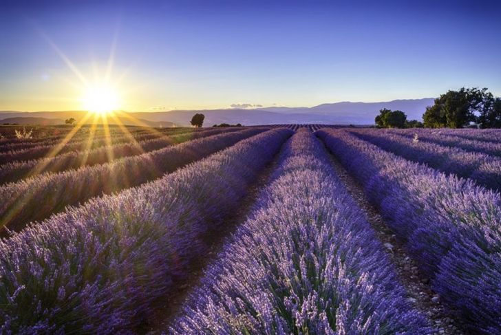
Blue and Orange
One of the most common complementary color pairings is blue-orange. Many artists throughout history have relied on these colors to add contrast to their works. The color combination became particularly important for impressionist painters. One of Claude Monet’s most striking works, Impression, Sunrise consists almost entirely of shades of blue and orange. Vincent van Gogh frequently relied on complementary colors, especially the blue-orange pairing. The famous painting Starry Night features an orange moon with orange stars against a blue night sky. Even his Self-Portrait consists mostly of orange and blue hues.

Red and Green
Though many people associate the red-green color pairing with Christmas, the complementary colors have appeared in other non-holiday media for hundreds of years. Van Gogh used red and green in many of his works, though the most famous example is likely The Night Café. Van Gogh believed that the red and green expressed “the terrible human passions.” More modern painters such as Pablo Picasso and Georgia O’Keeffe also used the pairing to great effect. Picasso’s Woman With Hat and O’Keeffe’s Anything remain popular pieces that exhibit the strength of complementary colors.

Yellow and Purple
Of the many complementary color pairings, yellow and purple have historically lacked the popularity of the other combinations. However, some of the most famous works from history use colors. For example, though yellow and purple do not dominate the piece, Monet’s Water Lilies uses hints of the colors throughout the water and flowers to give the painting a striking visual. Ray Spillenger’s appropriately named Purple and Yellow is a perfect example of how the contrasting colors are beautiful together.

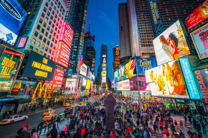
Modern Day Usage
Even now, the complementary colors and their various pairings occur in all forms of media. Because of their striking visuals and contrast, complementary colors are important parts of aesthetically pleasing design. Many films and TV shows use complementary colors in their advertising. Blue and orange, in particular, are incredibly prevalent across many movie posters. Other advertising pieces such as logos, retail displays, and signage all rely on complementary colors.
Practical Applications
There are many practical applications that take advantage of the contrasting nature of complementary colors. For example, because blue and orange are complementary colors, many life rafts, life vests, and tools for underwater use are orange. This is so the orange color will stand out dramatically against the blue ocean water. Additionally, though it has fallen out of favor in recent years, anaglyph 3D technology relied on complementary colors. The nostalgic glasses relied on the complementary nature of cyan and red to produce 3D images from screens.